Introduction
Introduction
In a world where technology influences every aspect of our lives, addressing behavioral shifts and promoting healthier habits among Gen Z and Millennials is a pressing challenge. My team and me, embarked on a journey to design a unique and user-centric app called "Exhale." This app aimed to support and guide young individuals in reducing their vaping habits, offering a comprehensive solution that includes behavioral shifts, control over urges, and distractions from triggers. This case study will delve into the UX design process that led to the creation of Exhale.
In a world where technology influences every aspect of our lives, addressing behavioral shifts and promoting healthier habits among Gen Z and Millennials is a pressing challenge. My team and me, embarked on a journey to design a unique and user-centric app called "Exhale." This app aimed to support and guide young individuals in reducing their vaping habits, offering a comprehensive solution that includes behavioral shifts, control over urges, and distractions from triggers. This case study will delve into the UX design process that led to the creation of Exhale.
Understanding the Problem
Understanding the Problem
The team's mission began by identifying a crucial problem: the need for a behavioral shift among Gen Z and Millennials to reduce the frequency and urge of vaping. Recognizing the severity of this issue, the team sought to create a digital solution that resonated with the target audience.
The team's mission began by identifying a crucial problem: the need for a behavioral shift among Gen Z and Millennials to reduce the frequency and urge of vaping. Recognizing the severity of this issue, the team sought to create a digital solution that resonated with the target audience.
Defining the MVP
Defining the MVP
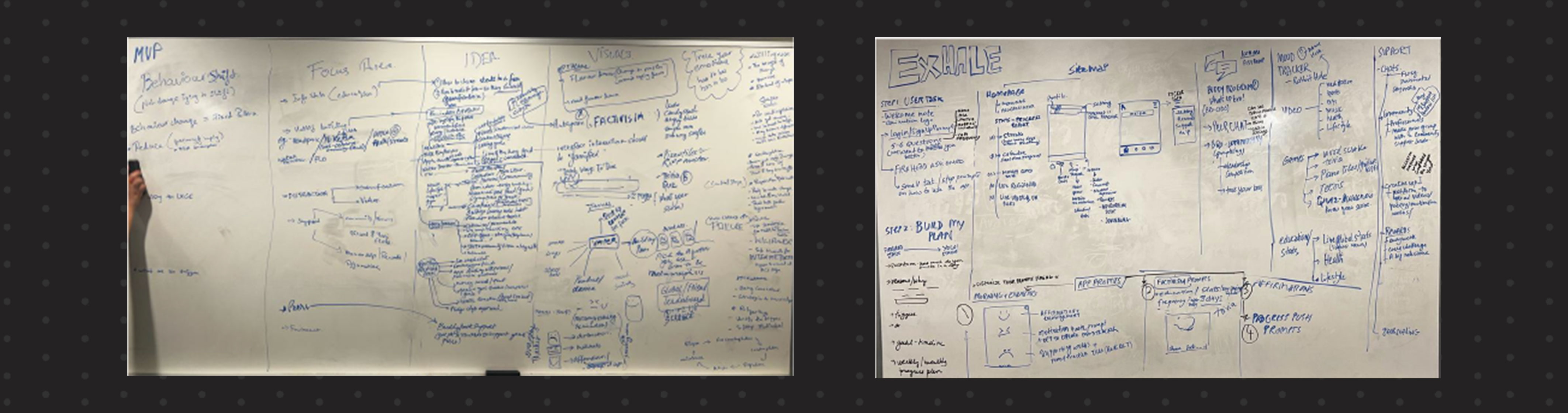
To start the design process, the team conducted mind mapping exercises, brainstorming various approaches to tackle the problem. Through extensive discussions and ideation, they identified the MVP (Minimum Viable Product) concept of "behavioral shift" and distilled it into three key factors:
Reducing the urge to vape
Controlling the urge
Distractions from triggers
User Journey Mapping
User Journey Mapping
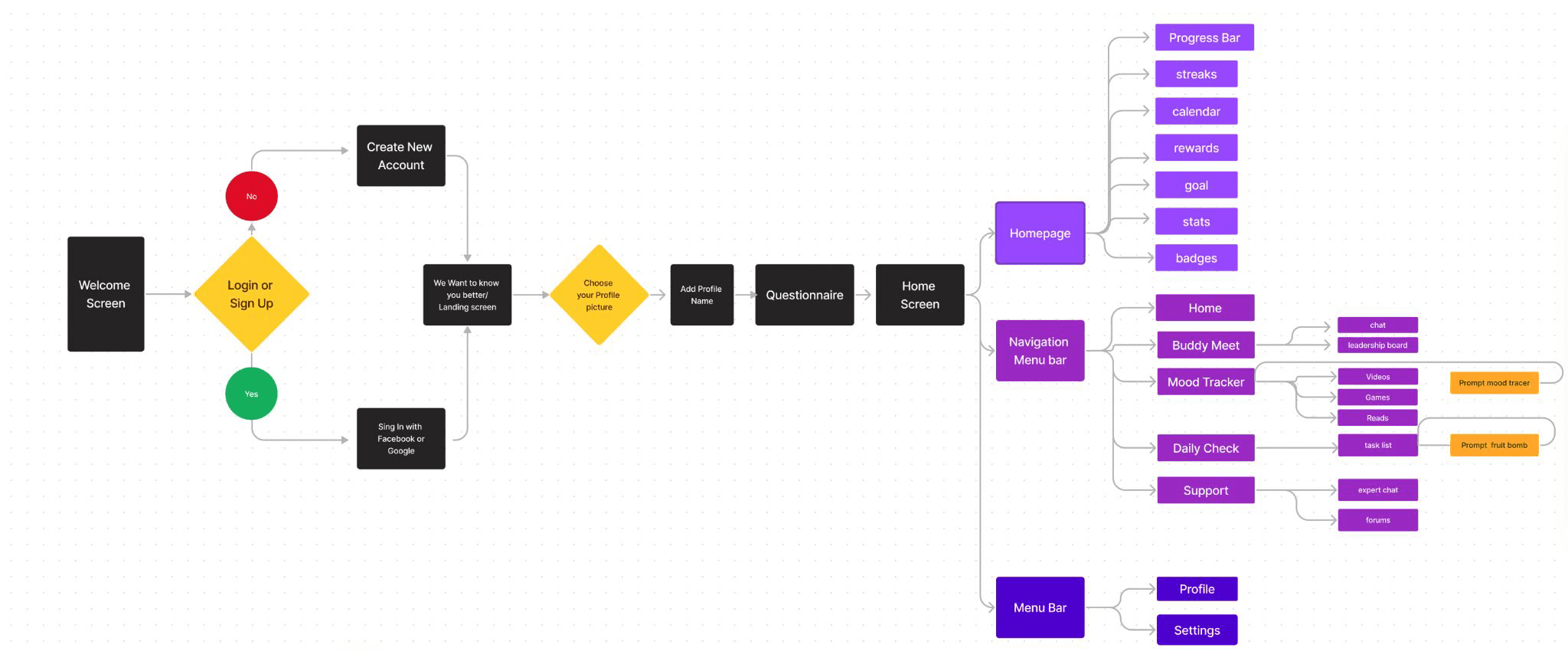
To provide a clear path for users, the team defined a comprehensive user journey through the app:
User Onboarding: Users download the Exhale app and complete the registration process. They choose a unique username.
Customized Plan Creation: Users answer a set of 8 questions, allowing the app to customize their reducing vape plan and daily tasks based on their responses.
Home Screen: After completing the questionnaire, users land on the home screen. This screen includes several key elements:
Smoghead Progress Tracker: Visualizing users' progress as they follow tasks.
Streaks: Highlighting the longest duration without vaping.
Calendar (MVP Focus): Displaying daily tasks and progress tracking.
Rewards: Accumulating points for redemption.
Goal Highlights: Providing daily motivational prompts.
Stat Tiles and Badges: Showing key statistics and earned badges.
User Engagement Features: Users can access additional features from the navigation bar, including:
Buddy Support: Interact with peers for motivation and advice.
Mood Tracker: Access videos, games, and educational content.
Support: Book appointments with experts.
Daily Check-In: Monitor daily tasks and progress.
Daily Prompts: Users receive a daily morning mood tracer notification, encouraging them to interact with their emotions and providing motivation.
Interactive Education: Users can click on falling fruits on the home screen to access educational content about vaping's health risks.
Understanding of what all exists and some apps that are liked by the users. Building insights on the whys.
Understanding of what all exists and some apps that are liked by the users. Building insights on the whys.
Low-Fidelity wireframe
Low-Fidelity wireframe
To visualize the initial concepts and user journey, the team created low-fidelity wireframes. These wireframes provided a basic structure of the app's layout and functionality. They allowed the team to iterate rapidly and gather user feedback early in the design process.
To visualize the initial concepts and user journey, the team created low-fidelity wireframes. These wireframes provided a basic structure of the app's layout and functionality. They allowed the team to iterate rapidly and gather user feedback early in the design process.

Locking the User Flow Steps
After determining the MVP, the team shifted its focus to refining the user journey through the app. This step involved categorizing and streamlining ideas to create a simplified, user-friendly experience. Low-fidelity frames were created to visualize and test the user journey, seeking feedback to further enhance the design.
Testing Low-Fidelity Concepts
The team conducted interviews and user testing to refine the low-fidelity concepts. Valuable insights were gathered, leading to the following improvements:
Simplifying engagement steps
Enhancing intuitiveness
Focusing on the MVP while reducing clutter
Revisiting app systems for optimization
High-Fidelity wireframe
High-Fidelity wireframe
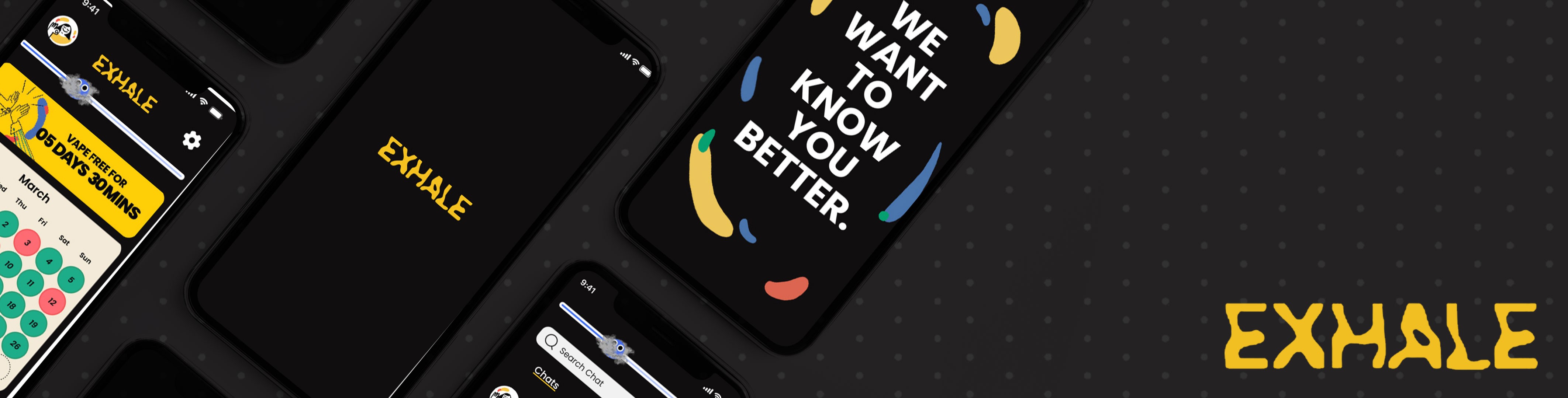
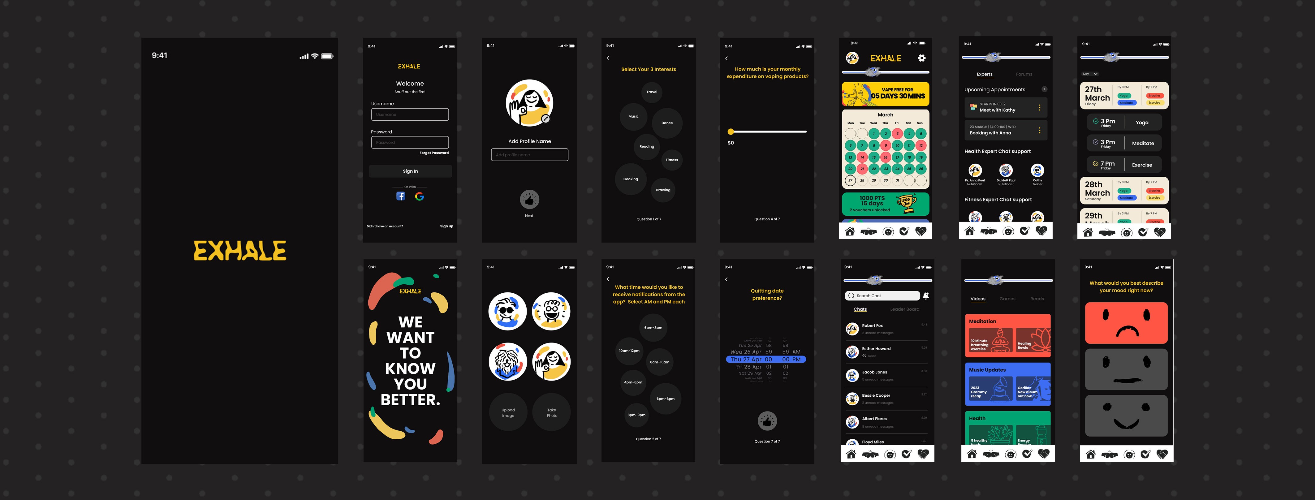
Once the low-fidelity wireframes were refined and tested, the team moved on to creating high-fidelity prototypes. These prototypes represented the finalized design with more detail, including colors, typography, and interactive elements. High-fidelity prototypes helped convey the app's visual identity and functionality.
Once the low-fidelity wireframes were refined and tested, the team moved on to creating high-fidelity prototypes. These prototypes represented the finalized design with more detail, including colors, typography, and interactive elements. High-fidelity prototypes helped convey the app's visual identity and functionality.
Designing User-Friendly Interfaces
The high-fidelity prototypes evolved into user-friendly interfaces. The app's home screen was carefully designed, with a clear hierarchy of elements, including:
Smoghead Progress Tracker: Visualizing users' progress.
Streaks: Highlighting their vaping-free achievements.
Calendar (MVP Focus): Assisting users in tracking daily tasks and progress.
Rewards: Encouraging users with redeemable points.
Goal Highlights: Providing daily motivational prompts.
Stat Tiles and Badges: Displaying key statistics and earned badges.
Enhancing User Engagement
The team incorporated features to enhance user engagement and support:
Buddy Support: Enabling users to connect with peers for motivation and advice.
Mood Tracker: Offering videos, games, and stats to educate and divert users' attention.
Support: Facilitating appointments with experts.
Daily Check-In: Allowing users to monitor their progress and to-do list.
Interactive Prompts and Education
To make the app more engaging, the team introduced a daily morning mood tracer, encouraging users to interact with their moods. They also incorporated an interactive visual element where users could click on falling fruits to learn about vaping's health risks.

Creative Strategy
Creative Strategy
The team carefully crafted the app's visual identity, considering the preferences of Gen Z and Millennials. Key elements included:
Dark UI: Incorporating a dark color palette for aesthetics, comfort, and battery savings.
Illustrations: Utilizing hand-drawn line art designs for an engaging and retro-inspired look.
Bold Texts: Ensuring a cohesive and memorable user experience with the 'Poppins' font.
Color Palette: Selecting red, green, and blue shades to resonate with the target audience.
Naming and Branding
Naming and Branding
After brainstorming, the team chose the name "Exhale" to symbolize connecting with one's breath and reducing reliance on vaping. This name is unique, memorable, and aligns with the app's purpose.
After brainstorming, the team chose the name "Exhale" to symbolize connecting with one's breath and reducing reliance on vaping. This name is unique, memorable, and aligns with the app's purpose.
Conclusion
Conclusion
"Exhale" represents a comprehensive UX design effort by Team 11 to address a critical issue among Gen Z and Millennials. Through careful research, ideation, testing, and creative design, the team created a user-friendly, engaging, and impactful app that supports behavioral change and helps users reduce vaping. "Exhale" not only stands out in its category but also aligns with the preferences and needs of its target audience, offering a compelling solution to a pressing problem.
"Exhale" represents a comprehensive UX design effort by Team 11 to address a critical issue among Gen Z and Millennials. Through careful research, ideation, testing, and creative design, the team created a user-friendly, engaging, and impactful app that supports behavioral change and helps users reduce vaping. "Exhale" not only stands out in its category but also aligns with the preferences and needs of its target audience, offering a compelling solution to a pressing problem.
Full Prototype
Full Prototype